Kent State University • Introduction to Visual Communication Design, Studio
Page Layout Series
PROJECT OVERVIEW
This assignment developed layout and hierarchy skills through a progressive series of typographic compositions using provided text. Across the series, the amount of content increased in both quantity and complexity, requiring students to refine their hierarchy decisions as constraints and information density changed.
METHOD / PROCESS
Students established a document grid using columns to control measure, alignment, and consistent text widths. Each composition explored hierarchy through position, scale, typographic texture, value/contrast, and grouping to clarify meaning and improve readability. Iteration emphasized using structure and spacing to guide the reader through increasingly complex content.
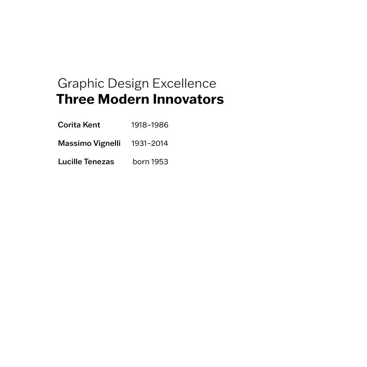
Page 1 (baseline hierarchy): Establishes the column grid and primary typographic hierarchy with restrained content, using scale and spacing to set a clear entry point.
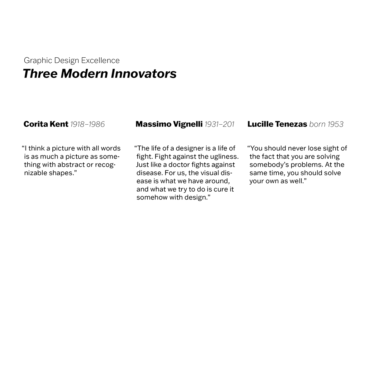
Page 2 (content expansion): Increased text load introduces multi-column alignment and stronger grouping cues, refining measure and typographic texture for readability.
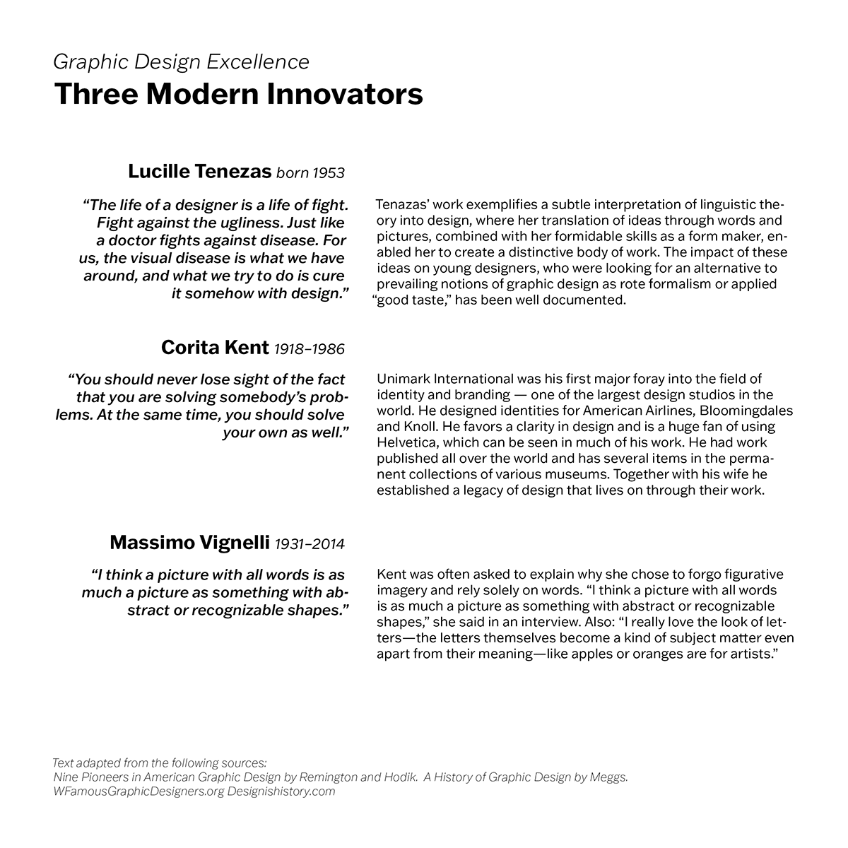
Page 3 (multi-section structure): Higher density content is organized through consistent grouping and repeatable hierarchy patterns, maintaining rhythm across multiple information blocks.
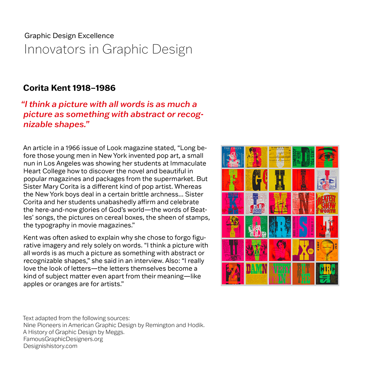
Page 4 (image integration): Adds a visual focal point while preserving grid discipline, balancing image emphasis with controlled text flow and margin structure.
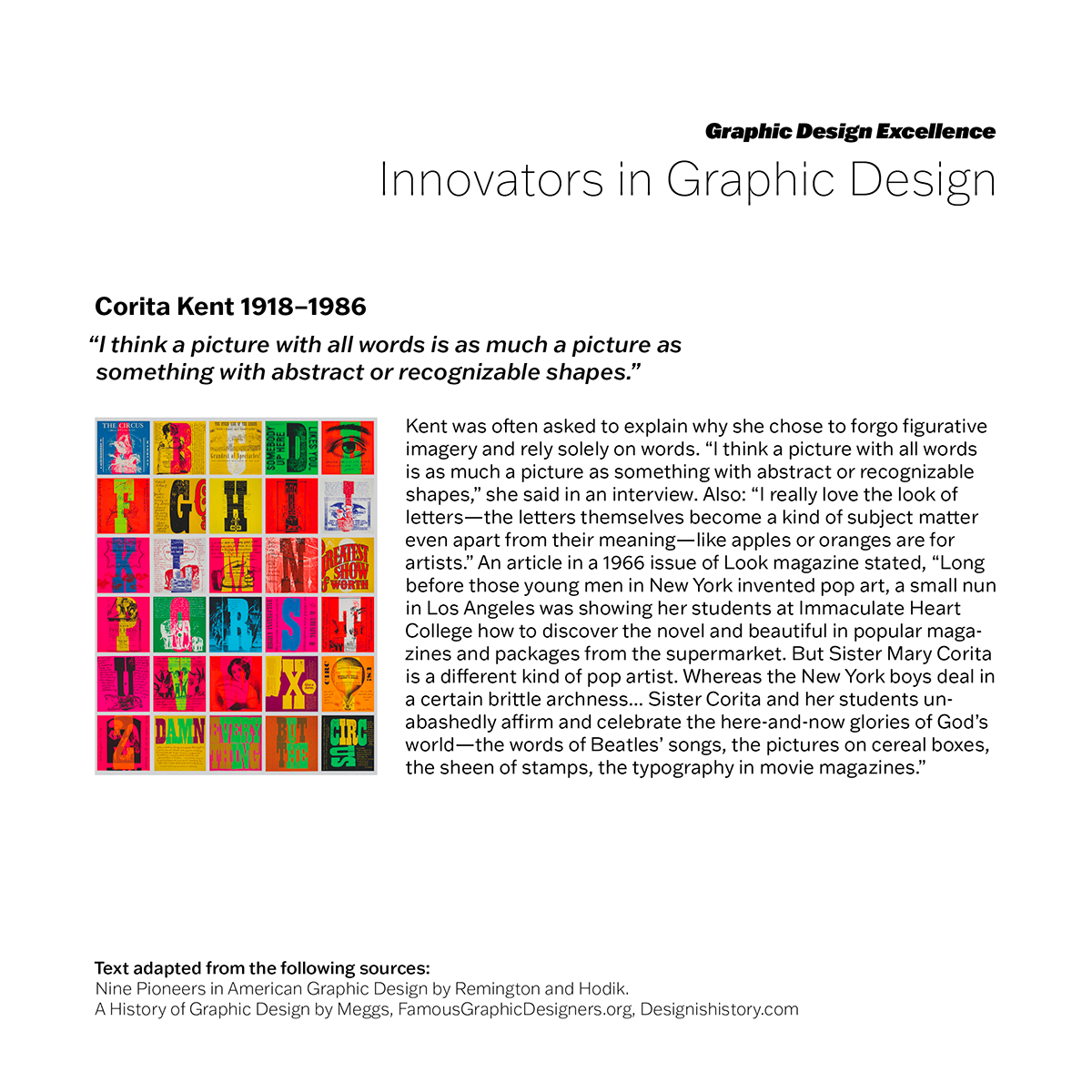
Page 5 (highest complexity): Final iteration manages maximum information density with a disciplined grid, refined hierarchy, and clear scanning paths created through contrast, alignment, and spacing.

