Kent State University • Typography I
Sequential Typographic Design: Booklet
PROJECT OVERVIEW
This assignment introduced sequential typographic design through the creation of an eight-page booklet based on a design-related topic sourced from the AIGA website. Students developed a narrative structure in which typography, imagery, and written content work together to communicate a focused aspect of the chosen subject over time, rather than in a single-view composition.
METHOD / PROCESS
Students researched their topic to locate and curate supporting text and images, then organized the content into a paced reading experience across eight pages. Layout decisions emphasized hierarchy, continuity, and transitions between spreads—using typographic structure, image placement, and page-to-page rhythm to guide the reader through the story in a clear, intentional order.
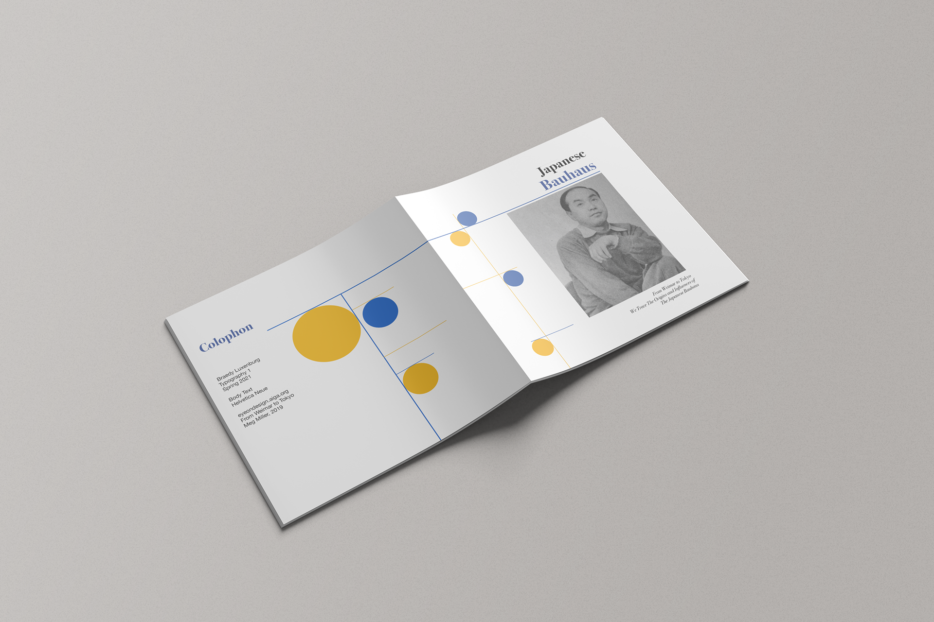
Title spread: A blue-and-yellow circle motif strung along thin rules carries the colophon on the left into the stacked “Japanese Bauhaus” title on the right, where a serif headline and a black-and-white portrait introduce the booklet.
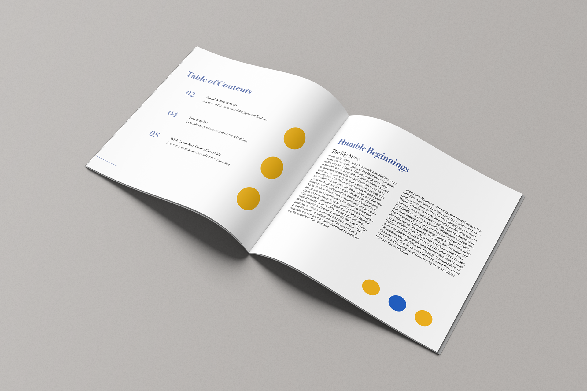
Spread 1: An italic serif contents list with large page numerals sets up the reading order, while “Humble Beginnings” opens the story in tight two-column text, with the recurring dots used as quiet markers for pacing.
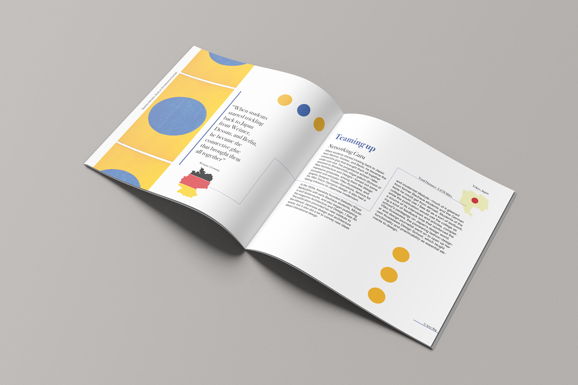
Spread 2: A large italic pull quote beside a bold yellow-and-blue panel gives “Teaming Up” a clear entry point, and a thin rule connecting maps of Germany and Tokyo draws the line from Bauhaus to Japan across the gutter.
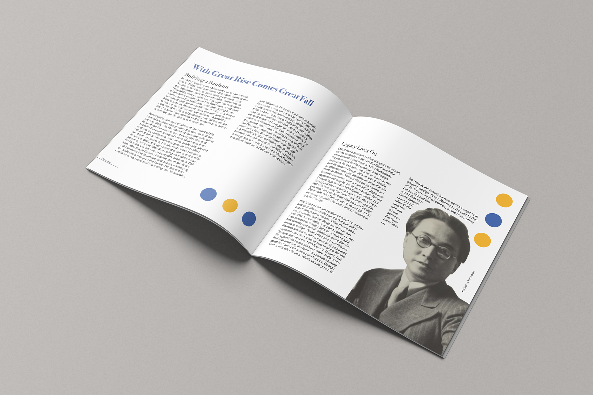
Spread 3: “With Great Rise Comes Great Fall” and “Legacy Lives On” close the story with denser two-column text, balanced by a large cut-out portrait whose edge the text wraps around, and the dot motif returning to tie the sequence together.
Colophon: “Japanese Bauhaus,” Typography I, Spring 2021. Body text set in Helvetica Neue. Source: “From Weimar to Tokyo” by Meg Miller, 2019, eyeondesign.aiga.org.
Where he is now: Braedy is now a fashion designer and the founder and creative director of Luxenburg, a New York–based label that has shown at New York Fashion Week. Follow Luxenburg on Instagram.

